Experience
Messaging
What are you going to tell people about your brand? See how brands position their marketing, promotions, and advertisements.
Share your purpose publicly
In 2016, Airbnb launched a campaign sharing their purpose with the world. By doing this, they made themselves and their Hosts accountable for ensuring "Anyone can Belong Anywhere." The campaign included:
- An online platform that allowed people to create their own version of the Airbnb logo
- A variety of communications, billboards, and merchandise
- A social challenge to create #onelessstranger, which included sending $10 to 100,000 community members and asking them to use the money to deliver a personal or creative act of kindness
- The 'Don't Go There. Live There.' video
Create an icon that transcends culture and language
To create an icon that embodied Airbnb's purpose of belonging, the company collaborated with branding agency DesignStudio. Over two weeks, DesignStudio had to "become Airbnb" to understand the company fully. They held over 50 staff interviews, which included everyone from kitchen workers to designers, and sent their own staff to 18 countries to live as guests and visit Airbnb offices. Through this collaboration, The Belo was created. It is an icon designed to transcend culture, language, and generations because:
- It is simple enough that anyone could draw it and make it their own.
- It embodies the ideas of connection, exploration, and love.
- It can serve as the universal symbol of Belonging as it is not rooted in an English wordmark.
Make your marketing about values
Create a message map for each product
Message maps are simple one-page visual descriptions of a product. At Apple, they use them to lay the foundation for all of their messaging from a 30-second elevator pitch to a 10-minute conversation with a customer. By keeping their message simple and consistent, Apple makes it easier for employees and customers alike to repeat and share the story.
Step one: Create a Twitter-friendly headline
This will be your overarching key message. It should summarize your product's value in one sentence that is less than 140 characters.
- iPod: 1,000 songs in your pocket.
- MacBook Air: The world’s thinnest notebook.
- iPhone: Apple reinvents the phone.
- iPad: A magical and revolutionary device.
- iTunes Music Store: Music downloads done right.
- iCloud: Stores your content and wirelessly pushes it to all your devices.
Step two: Create three (or at most four) supporting messages
Neuroscience finds that people can only recall about three or four pieces of information at most, so Apple boils their messages down to just that.
- The iPhone was (1) a revolutionary phone, (2) the Internet in your pocket, and (3) the best iPod ever created.
- The MacBook Air was (1) thin, (2) light, and (3) wicked fast.
Step three: Develop three or four details for each of your supporting messages
These details can include data, stories, and examples. This is where Apple staff have the flexibility to make the stories they share more personal or relatable to the customer.
Step four: Share and repeat the message ad nauseam
Relentless repetition is the key to memorability. Yes, it might seem creepily cultish; and yes, you're going to get tired of the message; but that's exactly when customers are able to just start repeating it themselves. So stay strong and stay the course.
Showcase your cause, not your product
Apple's 1984 ad, which introduced the Macintosh, shows no images and describes no details about the product. It is an ad focused solely on what drives Apple as a company and is considered one of the best television ads of all time.
Sell benefits, not features
Twenty-two months before the iPod was released, Creative, a company specializing in audio technology, introduced their own mp3 player. They had the qualifications, the experience, and were first to market, but their Zen player never gained popularity. The problem was that Creative's messaging focused on the features: "5GB mp3 player." Apple, on the other hand, focused on the benefit: "1,000 songs in your pocket."
Unfortunately for Creative, people don't care, and most times don't understand the features of a product. What they do care about is what the product could do for them. And that is what Apple's messaging always does—it answers the question: Why should the customer care?
Even when someone comes into an Apple Store, instead of using terms like 5G, 4K, and 1080P, sales associates focus on how the device benefits the customer: enjoy games, send email, take awesome photos, and so on.
Turn your ads into manifestos
The Apple store was designed to appeal to non-Apple users and show them what actually is possible with an Apple product. Before opening their doors for the first time, Apple ran this ad, 5 down, 95 to go, as their manifesto to those non-users.
Choose a brand name that is approachable
In a time when computers were intimidating to use, Steve Jobs wanted his computer company to embody friendliness and approachability. After visiting a commune in Oregon, which he would refer to as an apple orchard, Steve Jobs suggested to his partner, Steve Wozniak, that they name their new company Apple. They both figured, what could be friendlier and more approachable than an apple? In fact, the bite taken out of the logo was added to further humanize the brand.
Create messaging that is worth talking about
When first launching this billboard campaign, Chick-fil-A only showed the rubber chicken without any text or logo. It was only after thousands of people drove past it and media chatter began to rise that they added the rest.

Always have something to give away
Whether they are at a doctor's office or on a plane, Chick-fil-A associates are encouraged to carry plush Cows and Be Our Guest free sandwich cards with them wherever they go. They then readily hand them out to anyone who seems like they could use a pick-me-up or anyone who can tell them what the Cows say. These small acts of generosity strengthen the brand because they:
- Help associate the brand with being fun and generous.
- Generate testimonials in public areas for anyone in earshot to hear.
- Create a one-on-one brand building opportunity.
- Provide people with something that they can take home which will continually remind them of the brand.
Emphasize what's really important to your customers
When surveying their customer-base, Chick-fil-A found that "93% of respondents said quality time together is the single most important ingredient to creating favorite holiday memories, in front of food, decorating, music, parties and gifts." This lead to the creation of their holiday Time Shop ad.
Choose a brand name that reflects quality
For Truett Cathy, the choice to name his company Chick-Fil-A was simple. They specialized in chicken sandwiches, the best cut of beef is a fillet, and the capitalized A reinforces top quality.
Challenge internal taboos
Parisian Love was Google's first ever TV spot created by Special Guest. Conventionally, founders Larry Page and Sergey Brin were opposed to big television campaigns, as they saw them as a waste of resources that could be better spent on hiring more engineers. But this cultural norm was the exact reason why they ended up creating the ad. As Larry Page described it, the ad "sort of violates every known principle that we have, and every once in a while, you should test that you really have the right principles. You don't want to end up too rigid."
In the end, Ad Age called it "one of the best campaigns of the 21st century," and Time put it on its list of the "19 Best Super Bowl Ads of all Time.”
See what's next (2015)
Gretel, a branding, strategy, and design studio created Netflix's first tagline, which was meant to inspire feelings of exploration, innovation, anticipation, and curiosity.
Name your brand by combining two obvious words
By combining the words, internet and flicks, it's almost as if they knew streaming was coming from the very beginning. And it's also much better than it's placeholder name: Kibble.
Create the anti-advertisement
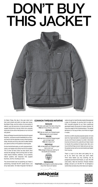
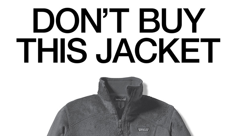
While Patagonia is in the business to make and sell products, part of their mission is to inspire and implement solutions to the environmental crisis. On Black Friday 2012, the biggest shopping day of the year, Patagonia pushed their mission forward by taking out a full-page ad in the New York Times that encouraged customers to only buy what they need with the tagline: Don't Buy This Jacket.
Be willing to offend
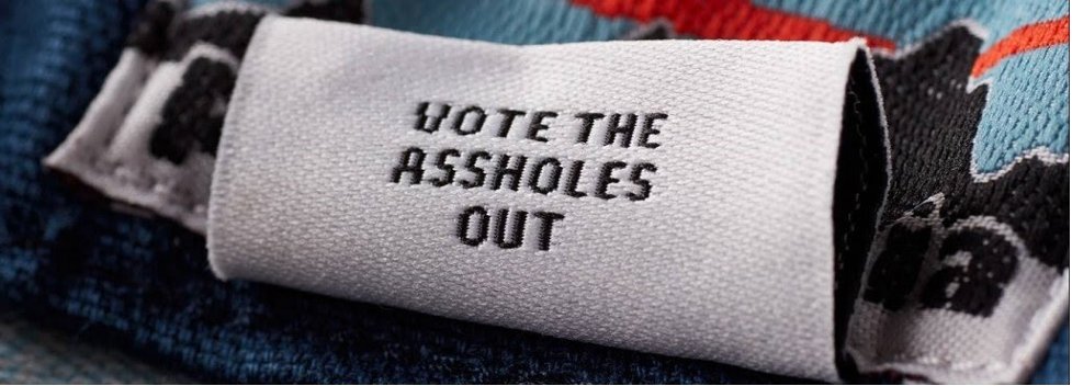
Hidden beneath the tag of Patagonia's Regenerative Organic Stand-Up Shorts reads a message: Vote the Assholes Out. While the tag was printed in 2020, the saying had been used within the Patagonia culture for years as a way to encourage people to vote climate-change deniers out of office. After the phrase was used by Founder Yvon Chouinard in a letter to a non-profit, that was all the approval the design team needed to add it to the shorts.
Use honest imagery to show who your core customers are and what they do
For Patagonia, imagery is not about taking photos of beautiful models backpacking the Appalachian Trail on an autumn day—that is too safe. They also don't set up staged shots of non-customers wearing Patagonia gear—that would be dishonest.
Instead, Patagonia's imagery focuses on capturing real people doing real things. Picture a climber "picnicking on the hood of a rusted Chevy at the base of a climb" or a "euphoric skier rising from a face plant." That's the imagery Patagonia wants, and in order to capture that, they use photos of their actual customers taken by actual customers (or their customers' photographers in the image below).

Create a consistent story across all channels
Considered the 'bible' for each selling season, Patagonia's catalog sets all editorial and pictorial standards for their website, hashtags, signage, and videos.
Choose a brand name that embodies your adventurous spirit
Founder Yvon Chouinard fell in love with Patagonia in Argentina and wanted to make clothing for those types of conditions: Super high winds with crazy cold temperatures. He also wanted to inspire “romantic visions of glaciers tumbling into fjords, jagged windswept peaks, gauchos, and condors.”
Create a mark that defines you
Inspired by the British Royal Seal, The Ritz-Carlton lion and crown mark were designed as a symbol of elegance and nobility. It then evolved in 2015 to "purposefully maintain the iconic luxury hotel company’s position with a new generation of guests globally."
Emphasize the experiences you offer, not the product
The Ritz-Carlton used to focus their messaging on the elegance of their properties, but as the company evolved, so has their messaging. Imagery and stories now focus on the unique and exotic experiences that their locations offer, as highlighted in their short-film series, The Stay.
Turn a legal issue into a PR event
In 1990, Southwest revealed their new slogan 'Just Plane Smart.' Stevens Aviation, who had been using a similar tagline, 'Plane Smart,' for years, contacted Southwest with a proposition: Instead of getting lawyers involved, the two CEOs would determine the rights to the slogan over an arm wrestling match.
Southwest took Stevens Aviation up on the offer and the two CEOs battled it out in front of 4,500 spectators and several news outlets. Southwest's CEO, Herb Kelleher, would end up losing the match but Stevens Aviation CEO allowed Southwest to continue to use the slogan. In the end, Southwest earned as much as $6 million in publicity and Stevens Aviation saw a 25% annual growth for the next four years.
Create ads that express your personality and embrace your values
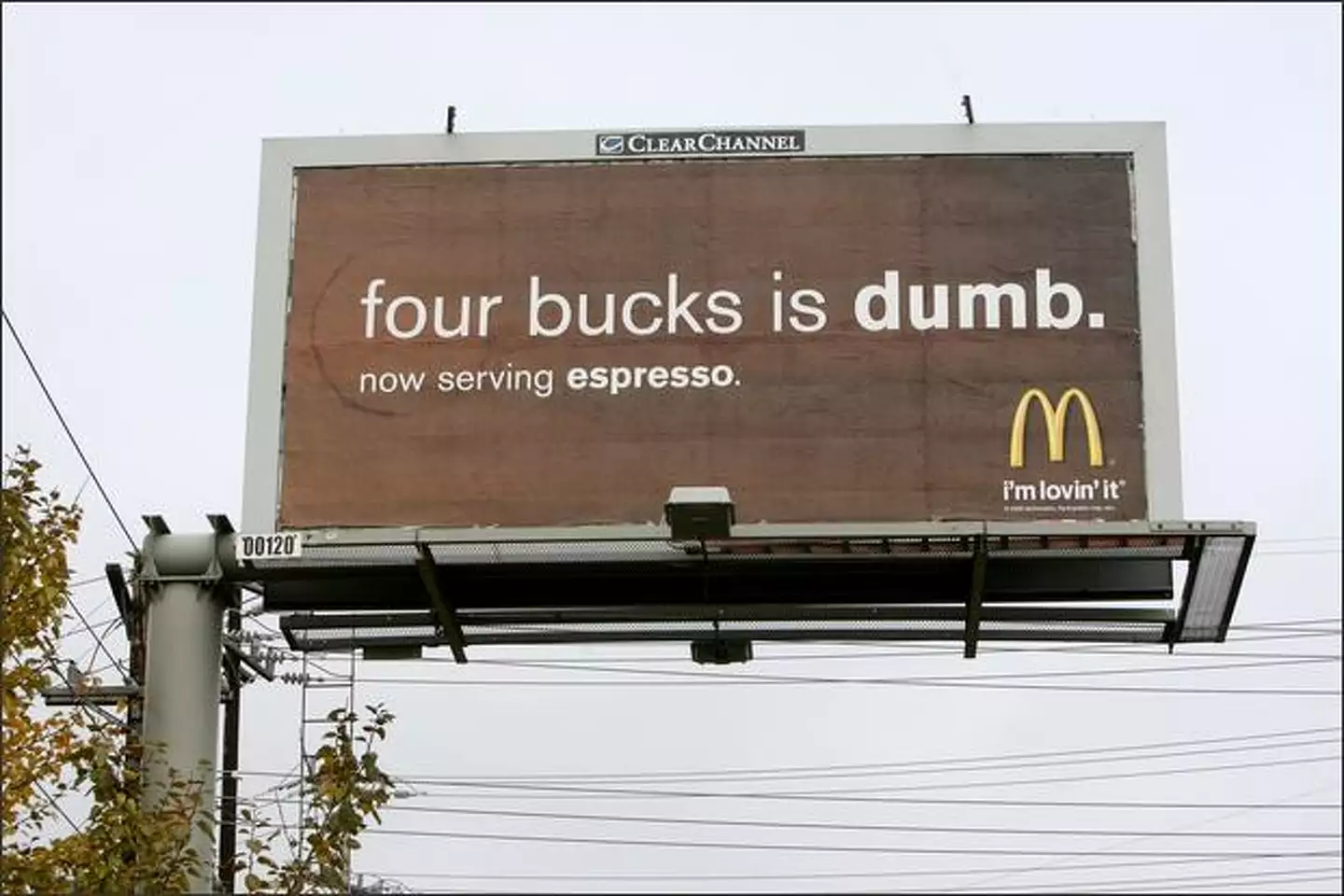
During the Great Recession, McDonald's began running billboard ads attacking the high cost of Starbucks coffee with their Four Bucks is Dumb campaign. In response to this, CEO Howard Schultz worked with creative agency, BBDO, to create a commercial that didn't attack others, but instead, showcased Starbucks' personality and their belief in the power of community. On November 2nd, the following commercial was aired only once, during Saturday Night Live.
Forget traditional advertising, just surprise and delight people
Pop quiz: A lone coffee cup is resting on top of a cab as it slowly starts to pull away—what do you do?
If you are the type of person that runs up to warn the cab driver, you would have been pleasantly surprised to receive a Starbucks gift card from the cabbie.
This clever empty magnetic cup was used as a way for Starbucks to surprise and delight potential customers. Instead of advertising in traditional ways like billboards, Starbucks prefers to find ways to bring joy into people's lives. They have even been known to have unadvertised free ice cream socials on hot days and free cups of 'Calm' on Tax Day, as well.
Choose a brand name that sounds powerful
Believing that 'st' words sounded powerful, Starbucks founders were inspired by the character Starbuck in Moby Dick. The name fit as it "evoked the romance of the high seas and the seafaring tradition of the early coffee traders." Now all they needed to do was an 's' at the end to make it sound more "conversational."
Focus your messaging on educating, not selling
Trader Joe's doesn't push for a hard sell in their messaging. You won't find any commanding statements or mandatory sentences like "Buy this!" or "Hurry now." You also won't see just a picture of a product and its price. Instead, they focus on informative advertising.
As Trader Joe's describes it, they are a "store of stories." Each promotion has A LOT of words, specifically written to connect with those who have a thirst for knowledge. Each product description goes into great detail telling its history, how it tastes, and how it differs from the "ordinary stuff."
The Trader Joe's grocery flyer, called the Fearless Flyer, can almost be overwhelming to the eye for anyone who is used to seeing only pictures and prices like in conventional grocery flyers. Even the store's 60-second radio spots focus more on educating people about food rather than brand recognition, only mentioning the company's name once in the opening line: "This is Joe Coulombe of Trader Joe’s with a word on food and wine."
Find creative ways to connect with your core audience's interests
In Trader Joe's early days, they would print the schedules for local operas, libraries, and symphonies on their grocery bags. Not only did this win them favor with these local non-profits but it directly connected the store to their core audience of the well-educated but underpaid.
Send mail to addresses, not individuals
As Trader Joe's founder, Joe Coulombe wrote: "When someone moves, someone just like them is likely to occupy the same address." This idea shaped Trader Joe's direct mail strategy to send their catalog to entire ZIP codes, not just single houses. The areas were chosen based on the likelihood that their core audience of overeducated and underpaid people would be there.
Thanks for listening (1976)
By the time Joe Coulombe retired from Trader Joe's he had written and recorded over 3,300 educational 60-second radio promotions for Trader Joe's. He ended off every single one of those with this tagline.
Pick a theme and use it to name your brand
With a plan to appeal to the well-traveled, founder Joe Coulombe attributes Trader Joe's name and Polynesian style to a mixture of past experiences and late 1960s trends, like:
- The Jungle Cruise ride at Disneyland
- The popularity of Mai Tais, Polynesian bars, and Trader Vic's restaurant
- Movies from his childhood like Red Dust, White Shadows in the South Seas, and Trader Horn
Don't promote commodities
Umpqua Bank made it a point not to spend scarce advertising dollars promoting bank commodities, like online or mobile banking. As former CEO Ray Davis saw it, "When the larger banks advertise their products and services, they're also advertising my products and services...If, for example, Bank of America spends a few million dollars to advertise the virtues of its mobile banking program, it's advertising for me and all other banks because customers assume that every bank offers mobile banking."
Instead, Umpqua focuses their advertising budget on their unique services and products, like their Go-To app that allows customers to text their preferred personal bankers about any banking issue.
Create buzz about new locations with handshake marketing
When Umpqua Bank opens new stores, they get people talking around town through what they call "handshake marketing." Instead of standard direct mail promotions, they rely on random acts of kindness and will:
- Randomly buy lunch for everyone at a restaurant.
- Buy out a nearby Peet's coffee shop for the morning.
- Leave a gift on nearby doorsteps, like a plant or all the ingredients for a spaghetti dinner, with a note inviting people to stop in.
- Buy an ice cream truck and deliver ice cream around town for a few days or weeks.
- Hand out $5 transit passes to commuters at random times.
Before opening their San Francisco store, Umpqua surrounded it with construction walls and had local artists recreate Twitter messages from people who used the hashtag #umpquasf. Umpqua would then select ones at random and send the tweeter a gift based on their interests. One person received a Nike gift card because he was a huge sports fan.
Start conversations with your community
An illuminated sign on the outside of an Umpqua Seattle store asked its community to fill in the blank: 'We want to have a conversation about ______.' A passerby could text topics to complete the phrase and have them appear on the store's facade in real-time. Inside the store, customers could also fill out postcards to finish the same statement and hang them on the display wall. Umpua used the submissions to determine which events they would hold next in their store.
Be honest, be real, and tell personal stories
'Be real and use your best judgment.'
Those seven words make up the entire Zappos corporate communication policy. That's it.
Sound scary? Maybe for some, but with a strong culture in place, Zappos believes that "people step up and communicate both honestly and respectfully." And yes, the policy applies to every communication opportunity.
- Presentations: When giving talks, there is no standard PowerPoint presentation. Instead, each person creates a presentation that shares their own personal stories and perspectives.
- Interviews: When reporters come into Zappos, they are given free reign to wander around and talk to whoever they want.
- Social Media: Zappos encourages employees to constantly film, photograph, and tweet about their culture on all platforms. The only advice they give is to make it 'raw, authentic, and responsible without the hype, polish, and extravagance of produced advertisements.'
Derive your brand name from another language
Originally named ShoeSite, founder Nick Swinmurn wisely changed the company name to Zapos—a derivative of zapatos, the spanish word for shoes. Co-founder Tony Hsieh recommended adding the extra 'p' to avoid accidentally mispronouncing it ZAY-pos.
